The exam project brief that we have been set is to do with The Inside, Outside and In Between. This is an interesting project brief to have been given because of the fact that there is many ideas that can be done with this topic and so many different materials to use to gain many marks and I would like to achieve a high grade for the end of A2 photography because I have high aspirations for future careers.
Mindmap
 | ||
Generalised Mindmap
I have chosen this starting point first because there can be some interesting outcomes to come from Movement and Light and reflection. I plan to look online for my Secondary research and in magazines to find different interesting photographers that I can use for inspiration for my ideas. The 3 photographers/ designers/ artists I will be looking at are Lee Friedlander, Uta Barth and Brad Carlile because I like the whole aspect of their work, such as the neon lit hotel rooms by Brad Carlile and Uta Barths abstract photography using light and reflection and Lee Friedlanders reflections in wing mirrors of cars and just normal reflections among todays society.
|


For my second starting point, I have chosen The Everyday because I found that it seems to help me generate more different ideas and I feel that I can do unique and different photos, using digital and darkroom experiments to get interesting and cool look to it. I can look online for my own artists and use inspiration from their outcomes and for primary, I can gather my own materials to use for initial experiments. The artists/designers/photographers that I may look at for this starting point is Man Ray, Kirsten Hoving, Pierre Cordier and Klaus Pichler. These people are really interesting to look at and their outcomes are really interesting, like Klaus Pichler and his dust balls, holding weird and interesting things with just random bits of string and colour in amongst the dust balls. The work of Kirsten Hoving, the ice sculptures, are really interesting because they are combining different materials together and it's materials that wouldn't normally be associated with each other.
Moodboard

2) Lisa Folino
3) Man Ray
6) Susan Derges
In-Depth Analysis : Cosmin Bumbut, David Farrow, Brad Carlile and Kirsten Hoving
Cosmin Bumbut
 |
| Cosmin Bumbut |
This piece of work was done by Cosmin Bumbut but I am not sure on what this artwork is called. Bumbut started studying at the Faculty of Journalism Bucharest and he was working at the same time as a Photographer for a theatre and Today Newspaper. Two years later he became a student at the Academy Of Theatre and Film where he studied Film Photography. Over the years, his photographs were exhibited in New York, Amsterdam, Fellbacj, Luxembourg, Thessaloniki, Madrid, Rome, Warsaw or Naples. His photographs were also published in Intineraires d'une vie. This work relates to the theme of documentary and contemporary because of the idea that we don't know what this work was for and all we can see if the cups on the table will with different coloured liquids and they are set in a pattern where the lighter liquids then merge into dark liquids. All the cups are arranged around pattern of the rose at the bottom of the table cloth but having liquid that close to the edge of a table could be dangerous so this could be deliberate or it could be on purpose and the photographer is trying to get us to understand why they have moved around the rose. To the left of the image, there are collection of empty cups and these could be waiting to be filled with the next colour or they could be spares.
This piece of work has been framed with a lot of cups is in the middle of the frame and some of the empty cups on trays are also shown and I think that the angle shown is a high angle to keep the liquid in sight but still have us asking ourselves why are they there. I feel that the overall arrangement of this piece is quite interesting because there doesn't seem to be a specific reason why he arranged it like this but I think the arrangement itself was planned to look like the colour gradient of the liquids.
This work doesn't really affect me in any special way because when I look at it, all I see is the liquid in the cups and arranged like a colour gradient and this could have been done with various other colours. This seems like a good idea to do because I am exploring different ways of using different materials that are available to me and I can also use different camera shots. I think that the words that accurately describe the work that has been done here is imaginative and creative. I also think that this work has inspired me to be creative with materials that I use and maybe come up with other ways of incorporating liquid into my experiments.
David Farrow
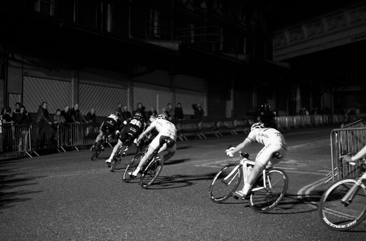 |
| David Farrow |
This photograph is done by a Photographer called David Farrow who is a student at City and Guild's Level 3 course in Photography and Photo Imaging. He also works in a South London Studio. This image comes from a series of images called Bicycle and these were taken in the run up to London 2012 Olympics to celebrate the pursuit of Road Cycling in the UK itself. I think that this image itself helps promote the use of Roads for cycling for different events, such as the Olympics and the Tour Du France and shows of the potential competition that someone could go in for to compete against other people. The subject matter in this image is of people but the original would have been in colour as it looks like it had been taken using a DSLR but then put on the computer to be digitally edited to turn it black and white. This gives it more of an effect because of the contrast in colour and the contrast between the black and white of the cyclists. The only thing that I can see and aware that is taking place is the cyclists going around the corner, but these have been captured with a very high shutter speed because of the sharpness of the image itself and the fact that the people are in focus and there is little to no blurring of the wheels, looking as if they have been posed in such a way that they're not actually moving.
The piece has been framed with a majority of the cyclists in shot and it seems like a medium shot because there's not a lot of detail that you can see from the cyclists jackets and the bikes that they are riding. The contrast is between the blacks, greys and whites and there's a strong contrast because where the light is overhead of them. I like this contrast because it defines the subjects against the background instead of merging them all together. I think that this image has been planned, as the fact that he may have set up his camera and managed to capture this at the specific time. He may have taken a few like this to see what shots he preferred or what different angles he can get and therefore I also think that this was spontaneously taken and not posed.
The techniques that have been used were that an overhead lighting was used to capture this sort of contrast when this image was most likely edited in editing software to get this hard contrast but with a soft grey gradient at the bottom of the image. I quite like this idea of using black and white to capture strong contrasts and I think that if this was in colour a lot of the contrast would be lost because then there would be too much detail for the eye to focus on when looking at this image.
Brad Carlile
 |
| Brad Carlile |
This photograph has been done by Brad Carlile and he is a photographer who creates/ captures these award winning photographs. He lives in both Portland, Oregan and New York City. He has shown his work internationally including MoMA Rio de Janeiro (Museum), Munich, Luxembourg City, as well as Austria, Qatar and China. He also has been in 58 US shows. He creates these colourful neon images of Hotel rooms, and it seems that he also uses Double Exposure, creating this ghost/ 3D look to the image and giving different aspects to the image itself. The colours of the images could have been done post-production or could have been done while the photographer is taking the image. I think that the theme that goes with this image is Documentary because of the way that he takes these images of different hotel rooms. Possibly fashion with the way that the room has been cleaned an posed with pillows set up. This could be used for a hotel room advert to make certain rooms stand out against others to make them more attractive. The subject matter that he is taking photos of are portrayed realistically but the colour of the top could have been either digitally manipulated or there could have been many different coloured lights in the room, giving of the different glows to give this 3D/ Double Exposure effects.
The image has been framed normally, cutting of at the left hand edge, consequently cutting of part of the light but it doesn't seem to affect the angle and the image captured. The distance is a medium shot, mainly having the bed as the focus of the photograph. The image is taken landscape, but the bed is at an angle, confusing the viewer who could possibly turn their head to view the image straight on instead of looking at the bed from an angle. The content is nothing surprising of what you'd find in a hotel room, therefore I am not surprised at this but sometimes I don't see images of hotel rooms in different colours and also I don't see images of hotel rooms at all so in a way, the colours sort of made me think of what the images were of but I think that this worked well.
This work doesn't really affect because it's nothing surprising or it's nothing emotional that appeals to me. If this was meant to be capturing an atmosphere, then it reminds me of a hotel room atmosphere with the lights that could be generally found in a club somewhere because hotel rooms don't generally have coloured lights in their rooms. I don't know what the photographer was really thinking when he took this, but maybe he was promoting the room or place.
Kirsten Hoving
 |
| Kirsten Hoving |
This photograph is done by Kirsten Hoving and she takes this photographs of 19th Century photographs frozen in/ placed under disks of ice to create feeling of the galactic swirls of stars, galaxies and spiral nebulae. To do these, she was influenced and inspired by the Collage and assemblage art of the American artist Joseph Cornell. Kirsten Hoving used ice as a still life object. She had to thaw the ice to create the translucent areas but then had to work quickly to capture the image before the ice thawed and melted completely into a puddle of water. I think that this sort of image relates to Documentary and the theme could be past-time memories, depending on the image and objects used to create this interesting collection of items.
The items used here are light bulbs, a collection of big light bulbs and small light bulbs with some small image, that seems to have been cropped to a miniature circle in the corner, away from the light bulbs. The relation between this selection of objects is something small but it could be something to do with shining light on this person that we don't even know about because of the fact that the image is cropped so tightly, just leaving the eyes and nose and ears on show to the viewer. This leaves the viewer curious to know why there is only partial bit of the face and they also want to know why there is a selection of light bulbs. I like this whole idea of letting people guess what the relation is between the different objects instead of just handing it to them on a plate for them to glance at and move on. The frame around the image is black, so that we can see through the ice that's thawing and that we can see the ice clearly in detail. The framing has also been close up, so there isn't a lot of space around the image, therefore making the eye not have to travel across loads of space to look at the middle of the image or what's in the image.
The items used here are light bulbs, a collection of big light bulbs and small light bulbs with some small image, that seems to have been cropped to a miniature circle in the corner, away from the light bulbs. The relation between this selection of objects is something small but it could be something to do with shining light on this person that we don't even know about because of the fact that the image is cropped so tightly, just leaving the eyes and nose and ears on show to the viewer. This leaves the viewer curious to know why there is only partial bit of the face and they also want to know why there is a selection of light bulbs. I like this whole idea of letting people guess what the relation is between the different objects instead of just handing it to them on a plate for them to glance at and move on. The frame around the image is black, so that we can see through the ice that's thawing and that we can see the ice clearly in detail. The framing has also been close up, so there isn't a lot of space around the image, therefore making the eye not have to travel across loads of space to look at the middle of the image or what's in the image.
This work doesn't affect me, but it gives me interesting ideas that I can use in my own work and that I would actually like to try something like this, even though it could be difficult to do. This piece of work could have been inspired by a story or something from past history. Words that I think describe this piece of work is interesting and different because of the simple fact that I haven't really seen something like this done before, using ice as a materiel instead of something more common such as paper. The use of the ice is different but what I think could be nice is using water instead on photographic paper to give this distorted look to them.
Idea mind map - First Film
Mindmap of different ideas
Digital and Film photographs
Digital and Film photographs
 |
| Paperclips and Staples in pink ice |
 |
| Paperclips and Staples in pink ice |
 |
| Reflections in a small bathroom mirror |
 |
| Liquid residue in a cup |
 |
| Red Ink Liquid in a cup |
 |
| Ink in a glass of water |
 |
| Ink in a glass of water |
 |
| Ink in a glass of water |
 |
| Ink in a glass of water |
 |
| Ink in a glass of water |
 |
| Ink in a glass of water |
 |
| 3D Image of an animal |


 |
| A single bag underneath table (In between floor and table) |
 |
| Two bags underneath table (In between floor and table) |
 |
| Slippers underneath table (In between floor and table) |
Exhibitions: Institute of Contemporary Arts - Juergen Teller
 |
| Juergen Teller - Pettitoe |
On the 13th March, we went up to London and there we visited an exhibition in the ICA Gallery by Juergen Teller. This exhibition was called 'Woo' and this exhibition provides a seamless journey through his landmark work, presenting iconic images of celebrities such as Kurt Cobain, Vivienne Westwood and Lily Cole. Also, exhibited here are more recent stories such as Irene im Wald and Keys to the House, which reveal the photographers more personal world in his hometown in Germany and his family home. Juergen Teller has a lot of provocative imagery and it's not one for the immature mind to look at. But this provocative imagery is then making people think of why the photographer is going outside the boundaries of what generally people like to look at. The image that I really liked looking at was this one of a dog that had been possibly washing in a sink next to a bunch of pink flowers (which is above). This image was done in 2011 and the other information given to it seems to be the place that it was taken was Suffolk. The name of this image is Pettitoe but the only thing that I can relate this to is the name of the dog in this image but I am not too sure on wether I am right or wrong. The image is of a dog being held with one hand in a sink and it looks to have been washed, because of his matted fur and expression of surprise and hurt that his owner or someone has just washed him. Next to the dog there is a vase of pink flowers. There doesn't seem to be an obvious reason behind this positioning but it could be showing that the dog isn't wet from being washed in the sink, but wet from someone pouring the water from the flowers on him. The two colours in this image is Pink and White, two feminine colours and this could show that the animal and the flowers belong to a woman but the hand looks rather masculine so this person could have taken the mans role and wash the dog who could have been filthy from running around outside.
The matter of this image is rather realistic and the arrangement of this image is nothing surprising but it makes you wonder what has happened or why something has happened. It doesn't seem to have been posed but it could be an after shot of when the dog looked different for a bit before it dried itself and fluffed up.
Collage's put into iMotion HD
Collage's put into iMotion HD
Darkroom items
 |
| One of my Contact sheets |
 |
| Negatives scanned in |


Ice Images


Exam Prep
My ideas at the beginning of the course was completely different to what I am doing now. I was hoping to do something interesting, using under the table as a basis but then I found this photographer who uses Ice and puts images inside the ice itself. I think that this concept is interesting because having things encapsulated inside ice and then it melts and then it becomes outside the ice and the water is in-between the images and the piece of paper that it is laying on. I enjoyed working with the Ice, just because it was something different and I could put different items in the water to freeze.
I have been majorly inspired by Kirsten Hoving and Klaus Pichler. The use of having items inside ice cubes and photographing them has come from looking at Kirsten Hoving because her work is interesting to look at and I mainly want to use words instead of images because words can be more meaningful.
Different experiments that I have done have helped me decide that I want to keep it simple and that if I shoot digital photographs, I would shoot in RAW because it has better quality and I can edit it in Photoshop Camara Raw before editing it in photoshop itself.
Overall, I have not really enjoyed the exam theme for Photography because it's been hard to try and link my ideas to the theme, but after finding Kirsten Hoving, I think that it's been more successful. I enjoyed working with prep work because it helped me explore different ideas. I don't know if I will be pleased with my final outcome but I will try my hardest to produce something that's really interesting and different.
No comments:
Post a Comment